Awards May 29, 2014
Color Trends - Neutral Appeal
A flexible hue appeals to the complete spectrum of promotional recipients.
In a world of noise, the word “neutral” promises an oasis of relief. Similarly, in fashion, while favored colors change with each season and certain shades mysteriously look great only when someone else is wearing them, neutral colors are everyone’s friend – an especially important quality in the promotional market.
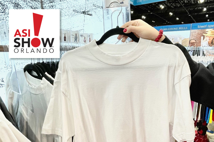
Neutral, of course, doesn’t mean boring. “We have some great neutrals in addition to the classic eco black, grey and ivory,” says Michael Ardelean, senior merchandiser at Alternative Apparel (asi/34850). “My favorite is Eco Stone. It’s a light, sophisticated heather color that reads off-white with some darker grey flecks.”
For instance, Ardelean suggests pairing an Eco Stone sweatshirt or tee with a darker color like indigo denim for an “amazing” look that works for both men and women in any season. And though black is a neutral shade so beloved that some resist wearing any other, those with a more adventurous taste can experiment with new choices.
“Dark charcoal heather is very popular as an alternative to black,” says Gabrielle Rohde, vice president of marketing & merchandising for Sportco (asi/88792). She recommends wearing it alongside black to create an interesting compound of neutral hues.
The season can also dictate which neutrals are best to build a look upon. “Light tan absolutely works best in spring and summer and is a fabulous neutral for those seasons,” says Rohde. “It’s the ‘black pant’ for that time of year.” Rohde also suggests using light tan as a layering piece, especially in the workplace, as a fresh alternative to white.
But neutrals aren’t a completely goof-proof approach to dressing in the dark. “I don’t think there’s such a thing as too much neutral,” says Ardelean, “but it depends on which one you’re talking about.”
Even within neutrals, there’s room for error, apparently. “It’s perfectly acceptable to wear a neutral palette sans color,” agrees Rohde. “But just because they’re neutrals doesn’t mean they can’t clash.”
Differences in shades of black, for example, can make an all-black ensemble look “awful,” according to Rohde, and the same holds true for any other neutral. “I would say it’s better to wear different shades of neutral colors like cream/tan/black together rather than to try and match them.”
Used well, it’s hard to go wrong with the right neutral, and wearers are guaranteed a timeless look that doesn’t play favorites.
Sponsored Content

Increase Productivity And Enhance Your Customer’s Brand
ANTI-FATIGUE Anti-fatigue mats are a great solution for a variety of applications....

The Perfect Banner For Every Situation
To close a sale, you need to direct your client to the perfect solution for their...
SPONSORED BY:
Wholesale Banners Online

5 Terms That Will Increase Your Performance Workwear Sales
When you present workwear, buyers want to hear how the apparel will perform on the...


